Photo Enlarger vs Image Upscaler: Which Works Better for Print?
Learn when to enlarge vs upscale for A3/A4 and 24×36 prints. Pixel targets, PPI math, and a fast preflight checklist for designers.
Designers rarely search for “photo enlarger” because they want a bigger number in a file’s metadata. They search it because the client wants an A3 poster by tomorrow, and the only asset they have is a tiny JPEG.
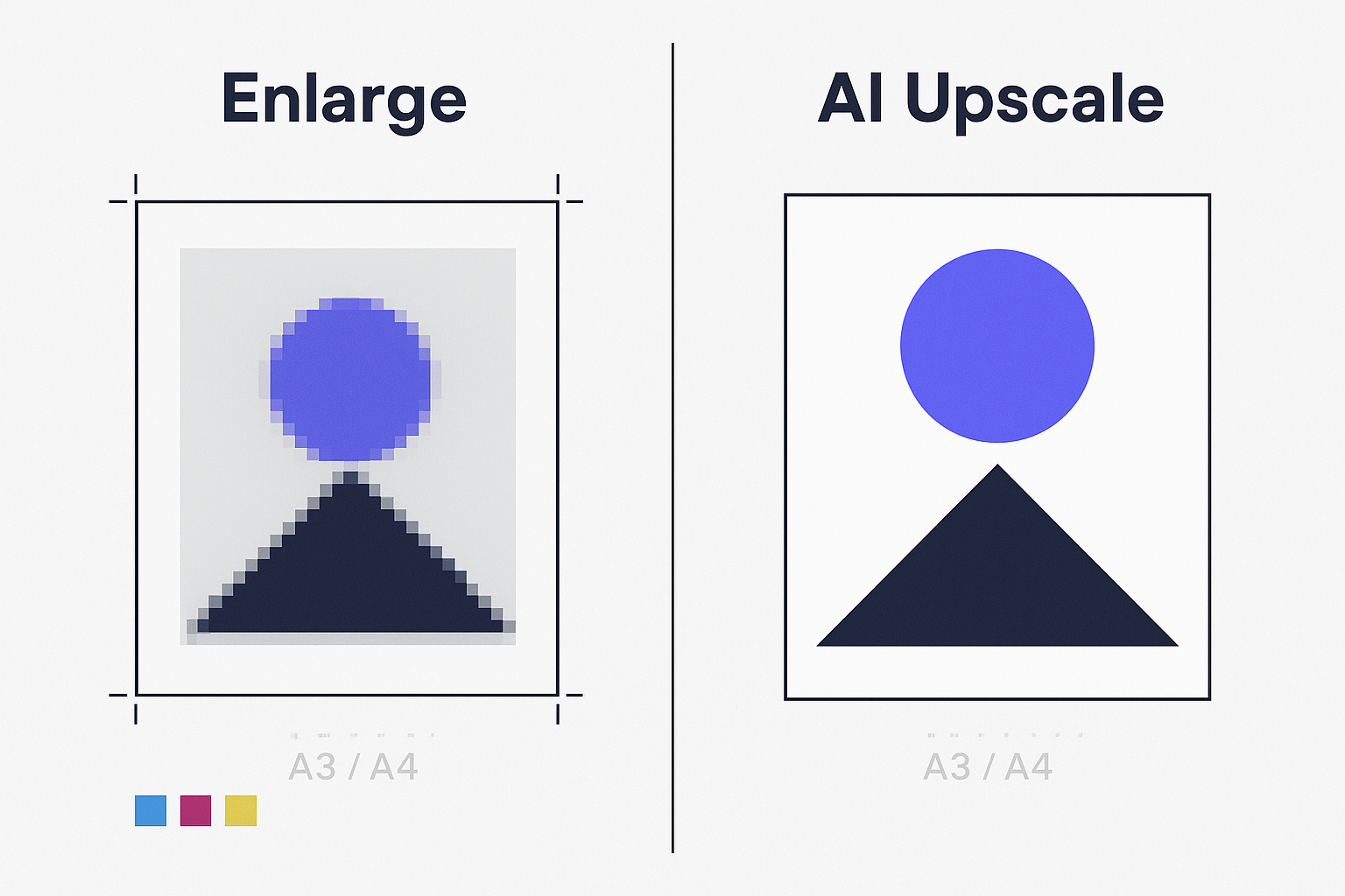
Here’s the blunt truth: for print, “enlarge” and “upscale” only look similar until you measure pixels. One is about placing the existing pixels on a bigger canvas. The other is about creating more pixels so the image can survive real-world print sizes.
Key Takeaway: If your image doesn’t have enough pixels for the target print size, “enlarging” (resizing without adding meaningful detail) won’t save you. You need upscaling—and for posters, AI upscaling is often the fastest way to add usable resolution without a reshoot.
Quick comparison: photo enlarger vs image upscaler for posters
Criteria (print-focused) | Photo enlarger (typical meaning) | Image upscaler (AI super-resolution) |
|---|---|---|
What it actually changes | Often just size/scale; may resample with basic interpolation | Adds pixels using learned patterns to rebuild detail |
Best for | Minor size bumps, layout proofing, distance-view posters with forgiving art | Low-res assets that must print cleanly (especially close-view) |
Biggest risk | Softness, jagged edges, visible pixel blocks | AI artifacts (halos, fake texture), over-sharpening |
Text & logos | Usually degrades quickly when pushed | Can improve edge clarity—but must be proofed |
When it “wins” | When you already have enough pixels and only need formatting | When pixel math says you’re short for the print size |
The print reality designers care about: pixels first, then DPI
If you remember only one formula, make it this:
PPI = pixel dimensions ÷ print size in inches
Design tools often label it “DPI,” but the practical point is the same: your print sharpness depends on how many pixels you’re printing per inch.
Cloudinary explains this clearly in its guide on DPI vs pixels: changing DPI/PPI metadata without adding pixels doesn’t magically create detail—it only changes how large the image prints by default.
A fast rule of thumb for posters
300 PPI: safest for close-view prints (flyers, brochures, posters people read up close).
150–200 PPI: often acceptable for large posters viewed from a distance.
HP’s large-format team notes posters commonly fall in the 150–300 dpi range, depending on viewing distance.
Print sharpness: when “enlarge” is fine vs when you must upscale
When a “photo enlarger” can be enough
Use a basic enlarge/resample workflow when:
your image already meets the pixel target (or is close), and
the design is forgiving (soft gradients, photography, no tight type), and
you’re making a small jump (e.g., 10–20%), and
you’ll proof it.
When you need an image upscaler
You’re in upscaler territory when:
the image is clearly below target pixels,
the design has type, logos, line art, or hard edges,
the poster will be seen at close range (lobbies, retail signage, trade shows), or
you’re stretching 2× and beyond.
Let’s Enhance summarizes the core idea in its print explainer: if you’re short on pixels for the target size, upscaling is how you add the resolution needed for print.
A4/A3 + 24×36 pixel targets (150 PPI vs 300 PPI)
Use these numbers as a practical preflight. If your source file is below the target, plan to upscale or redesign smaller.
A4
300 PPI: 2480 × 3508 px
150 PPI: 1240 × 1754 px
(Reference: FeetToPixels table of paper sizes in pixels.)
A3
300 PPI: 3508 × 4961 px
150 PPI: 1754 × 2480 px
(Reference: the same FeetToPixels A-series conversion.)
24×36 inches
150 PPI: 3600 × 5400 px (often acceptable when viewed from a distance)
300 PPI: calculate with the formula (24×300 by 36×300) and confirm with your printer’s spec
Some print guides cite 24×36 at 300 PPI as 5400 × 10800; others cite higher width values. The reason for the mismatch is simple: different sources assume different quality bars and workflow constraints. Don’t guess—do the math, then match it to the job.
A practical starting point (with viewing-distance context) is Laboo Studio’s 2026 guide that states 24×36 at 150 DPI is ~3600×5400 and at 300 DPI is ~5400×10800.
Pro Tip: If the poster includes small text, QR codes, or fine line art, treat 300 PPI as the default unless you have a strong reason not to.
Text and logos: the decision hinge most designers miss
Most “photo enlarger” searches are really about edge integrity:
tiny type turning mushy
logos getting stair-stepped
outlines looking jagged
That’s why a pure “enlarge” approach fails faster than designers expect. Interpolation can make a photo bigger, but it rarely makes edges more convincing.
An AI image upscaler can do better—but it can also introduce halos or invented texture.
Your job isn’t to trust the tool. Your job is to proof the failure modes.
The 30-second edge check
Before you send anything to print:
Zoom to 200–300% in your design app.
Inspect three zones:
sharp edges (logos, typography)
skin/organic texture (if any)
flat gradients (sky, backgrounds)
Look for:
ringing/halos around edges
crunchy over-sharpening
repeating “AI texture” patterns
If the upscale looks great at 200–300%, it usually holds up when printed at typical viewing distances.
Workflow speed: what to do under deadline
When you’re up against time, a practical workflow is:
Calculate your pixel target (size in inches × target PPI).
If you’re short, upscale first, then do your final layout.
Export a print-ready proof PDF and, if possible, run a small proof print.
If “Photo Enlarger” on your site is essentially the same capability as an upscaler under a different name, the key is to steer the user toward the correct action: don’t just “make it bigger,” make it meet the pixel target.
Where Artedge AI fits in (and where it doesn’t)
If you want a quick test run, an online upscaler can be a practical bridge between “we don’t have the right source” and “we still need this poster.”
For example, Artedge AI Image Upscaler supports common web formats (JPG/PNG/WebP) and offers upscale factors like 2×/3×/4×. That’s often enough to close the gap for A4/A3 posters—and sometimes enough to make a 24×36 job acceptable depending on viewing distance and the content type.
If your site also calls this same capability a “photo enlarger,” that’s fine—but this page should steer readers toward the right action: hit the pixel target for the print size, then proof edges before you send it to the printer.
The constraint to keep in mind is simple: you can’t upscale forever. If your starting file is extremely low-res (or full of compression damage), you’ll hit artifact limits before you hit print-perfect.
A practical decision rule you can use today
Use this quick rule:
If your file meets the pixel target (or is within ~10–15%), enlarge and focus on layout, color, and export settings.
If your file is below the target by a meaningful margin, upscale first, then layout.
If the design includes small text/logos and will be viewed up close, assume you need more pixels (and proof the edges).
FAQ
Is DPI the same as PPI?
Not exactly. DPI is about printer dot placement; PPI describes pixel density in the image relative to print size. But in everyday design workflows, people often say “DPI” when they mean “PPI.” What matters is: do you have enough pixels for the inches you’re printing?
Can I just set my file to 300 DPI in Photoshop?
You can change the number, but it won’t create new detail unless you actually resample (add pixels). Cloudinary’s explanation of why DPI changes don’t add detail is a good sanity check.
Is 150 PPI good enough for a 24×36 poster?
Sometimes—especially if it’s viewed from several feet away and the design is photo-heavy. A common rule is that distance-view posters can work around 150–200 PPI, while close-view pieces should aim higher. If the poster has small text or will be inspected up close, push higher.
Will AI upscaling ruin my typography?
AI tools vary. Some improve edges; some introduce halos or weird texture. The safest approach is the 30-second edge check: zoom in, inspect edges, then proof.
Next steps
If you’re trying to salvage a low-res asset for A4/A3 or a distance-view 24×36 poster, run a quick upscale test and proof the edges before you commit. If you need a fast way to add pixels, use an AI image upscaler to generate a higher-resolution version, then drop it back into your layout and export a print-ready proof.
Tags

Dr. Katherine L. Whitmore
Dr. Katherine L. Whitmore specializes in AI-powered image enhancement and e-commerce visual optimization. She writes practical, data-driven guides on improving product image clarity, meeting marketplace standards, and increasing conversions through high-quality visuals.
Ready to Enhance Your Photos & Videos?
Improve clarity, restore old images, and upscale to 4K with natural, artifact-free detail — in seconds.
Start Creating