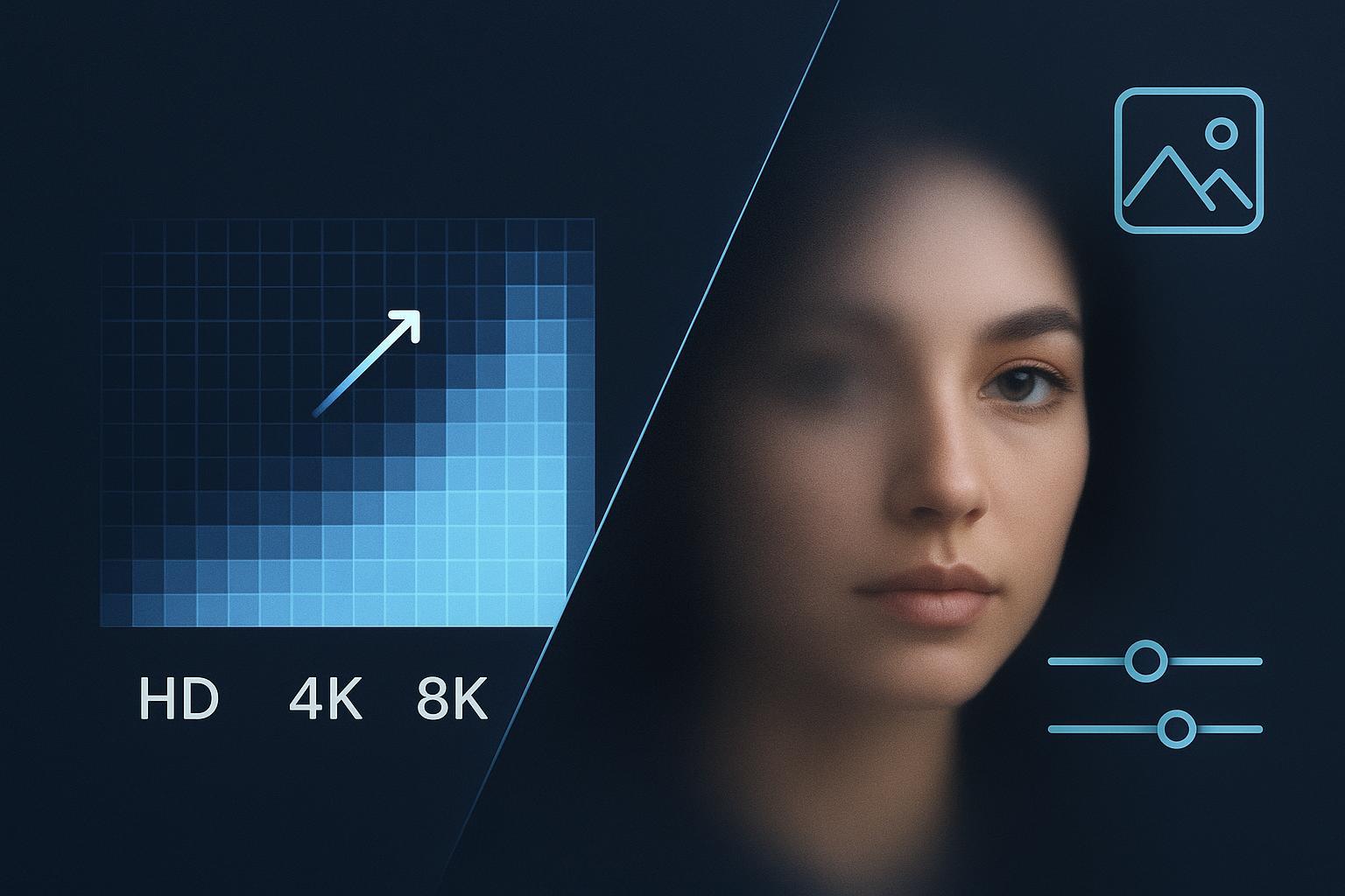
4K Upscaler Guide: When 2×, 4×, and 8× Actually Look Best
A practical, decision-first ultimate guide to choosing 2x, 4x, or 8x upscaling for web and print—pixel math, viewing-distance rules, restoration workflows, and examples. Read now.
Creators, photographers, and designers don’t need another 101 on “what is upscaling.” You need a fast, defensible way to decide: stop at HD, move to 4K, or push to 8K—without wrecking texture or inventing detail. This guide gives you a practical decision tree driven by output context (use, size, viewing distance), then refines the choice using source quality (noise, compression, blur, texture sensitivity). Along the way, you’ll find side‑by‑side reasoning, pixel math for print, and a clear answer to “when 8× looks worse.”
Key takeaways
Start with the output, not the tool. Medium, physical/display size, and viewing distance determine whether 2×, 4×, or 8× will be perceivable.
For screens, 1080p → 4K is the natural 2× jump and the default for 4K delivery; higher factors rarely help at normal seating distances.
For print, compute pixels = inches × target PPI (300/240 for close, 150–200 for distant) and pick the smallest scale that meets the pixel minimums.
Source quality is your governor. Clean inputs can tolerate 4×; noisy/compressed/soft sources usually cap at 2×–4× after restoration.
8× is niche. It often exaggerates halos/false texture and adds no benefit at typical viewing distances.
The decision tree at a glance
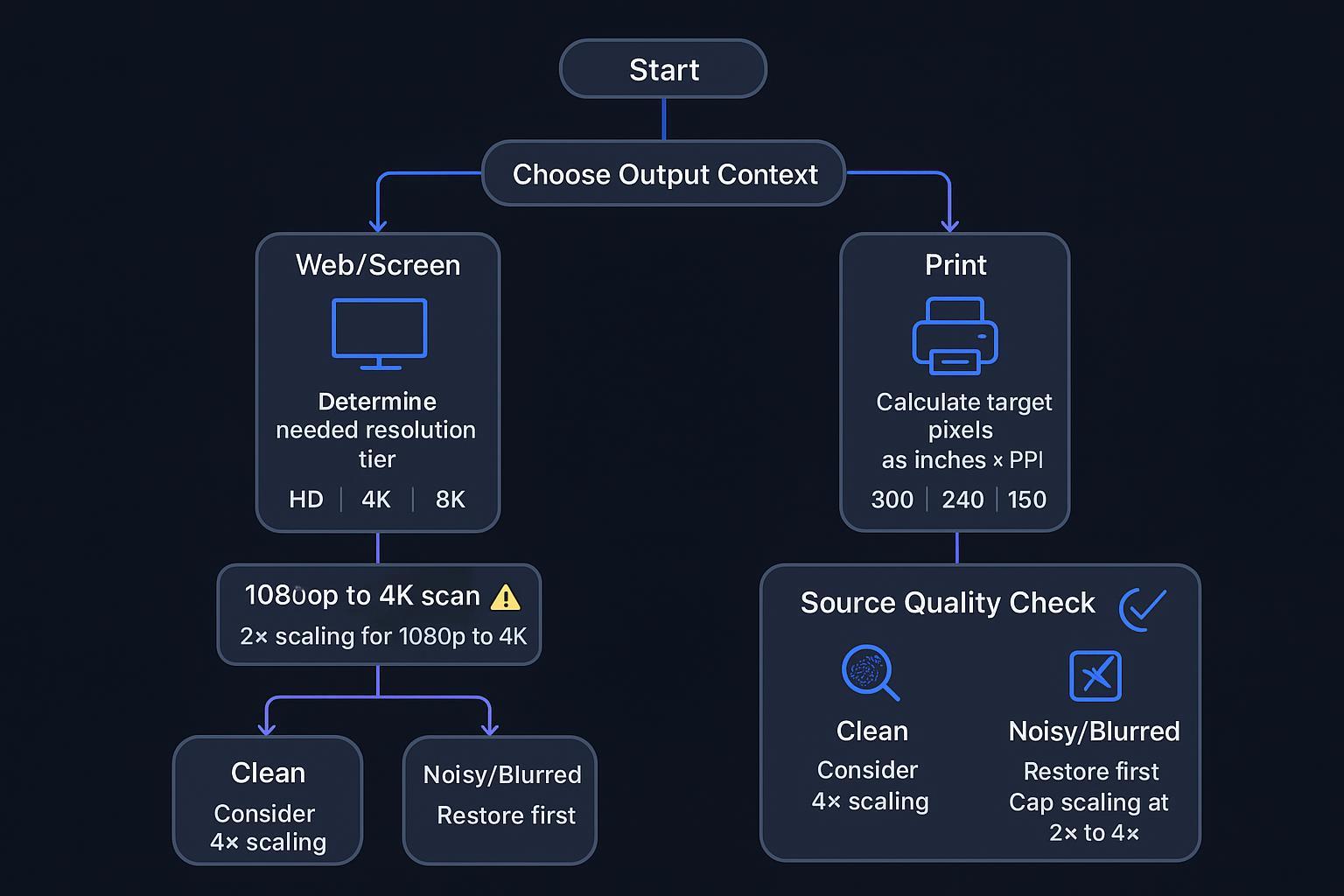
Here’s the simple flow you’ll use throughout this guide. First, choose the output context. For web and screens, your panel’s native resolution caps perceived detail. 1080p → 4K (2×) is the workhorse, and 4×/8× won’t look better on a 4K panel. For print, convert physical size and viewing distance into target pixels using PPI, then pick the smallest upscale that meets those pixels. Next, modify your choice by source quality: clean, detailed originals can justify 4× when pixels are short; noisy/compressed/blurred sources should be restored first and usually cap between 2× and 4×—especially on skin and skies.
For objective grounding on screen distance and resolution visibility, see the RTINGS size‑to‑distance guidance, which distills SMPTE‑style viewing‑angle heuristics, and Sony’s 4K viewing‑distance note. At common living‑room distances, 4K vs 1080p differences fade on 55–65" TVs, so chasing 8× brings no practical benefit. Read more in the TV distance analysis by the team at RTINGS on size to distance and in Sony’s 4K viewing distance recommendation.
How to choose a 4k upscaler for web vs print
Screen delivery: when 2× to 4K is enough. On 55–65" 4K TVs at roughly 8–10 ft, viewers with 20/20 vision struggle to see consistent gains from 4K vs 1080p unless they sit closer. That means upscaling beyond 2× for a 4K panel usually doesn’t add perceivable detail, and it can amplify artifacts. See the evidence in the RTINGS 8K vs 4K overview.
For desktop or large high‑PPI monitors at close range, gains from higher input resolution appear sooner—but only if the display can render it. If the target display is 4K, any 4× or 8× image will still resolve to 4K at display time, so the prudent move is to default to 2× and spend your time on restoration.
Print delivery: use PPI math, not guesswork. Required pixels = inches × target PPI. Typical targets: close inspection (≈10–15") at 240–300 PPI; wall viewing (≈3–6 ft) at 150–200 PPI. Education and trade sources converge around these bands, including the SAIC Service Bureau’s distance‑to‑PPI table and Photoseek’s practical note that ~240 PPI looks sharp at ~15". See SAIC’s Resolution vs Viewing Distance guidance and this Photoseek technical explainer on print sharpness vs distance.
Quick PPI table for common sizes
Print size (in) | Close 300 PPI | Quality 240 PPI | Distant 150–200 PPI |
|---|---|---|---|
8 × 10 | 2400 × 3000 | 1920 × 2400 | 1200–2000 × 1500–2500 |
11 × 14 | 3300 × 4200 | 2640 × 3360 | 1650–2200 × 2100–2800 |
24 × 36 | 7200 × 10800 | 5760 × 8640 | 3600–4800 × 5400–7200 |
Tip: For large wall prints, favor the 150–200 PPI band to avoid unnecessary extreme upscaling. When you do need more pixels for print, a dedicated 4k upscaler can be appropriate—see the product overview on the 4K Upscaler page.
Source quality triage: let the file condition drive the cap
Before choosing 2×/4×/8×, audit the source. Resolution and compression matter: low‑bitrate or heavily compressed sources carry blocks and ringing, and upscaling multiplies them—so apply deblock/denoise first, then reassess. Motion or defocus blur can crystallize trails at large scale factors; use targeted deblur, then prefer 2×–4×. Texture sensitivity also matters: skin, skies, fabric weaves, and foliage are susceptible to false detail. Favor 2× with restrained sharpening and add a subtle, consistent grain if needed.
If restoration is the bottleneck, see this practical explainer on how to increase image resolution without blur and the triage between fixing softness vs sharpening in Remove Blur vs Sharpen. For damaged or low‑quality inputs, a restore‑then‑upscale workflow like the one outlined in the HD Photo Converter page can help sequence the steps.
2× vs 4× vs 8× — where each actually looks best
2× (workhorse). Best for 1080p → 4K video delivery, most web hero images, and moderate print enlargements to meet 240–300 PPI for smaller sizes. It’s also the safer pick for portraits and skin‑sensitive work because it preserves structure with minimal artifact synthesis. For the 1080p → 4K path specifically, practitioner guides recommend a clean 2× route as the default (see NLE practice in the Boris FX 1080p to 4K workflow).
4× (situational). Best for upconverting SD/720p to 4K/8K after proper restoration; for large format prints where 2× still misses pixel targets; and for texture‑rich content when the source is very clean. Caution: inspect edges and fine lines for halos/ringing; reduce sharpening radius/amount if needed; confirm that viewing distance reduces scrutiny.
8× (niche). Reserve for exceptionally clean, sharp sources when meeting very large print pixel minimums or extreme crops for workstation‑distance inspection on very large/high‑PPI displays. It often looks worse on low‑quality/compressed sources and on faces/skin; animated or stylized content with limited real detail is also risky. Any case destined for typical living‑room TV viewing won’t benefit—testing shows 8K offers no advantage over 4K at normal distances (see RTINGS’ 8K vs 4K explainer).
Practical workflows you can reuse
Restore‑first, then upscale. Assess native resolution, compression/noise, motion or defocus blur, and texture class (skin, foliage, UI/text). Preprocess with denoise/deblock, apply gentle deblur, and normalize tone/color. Decide scale by deriving target pixels (web tier or inches × PPI), then pick the smallest factor that achieves the goal—usually 2×, sometimes 4×. Upscale in a single clean pass; avoid chaining extremes (e.g., 2×→2×→2×) unless validated by crops. Finally, audit 100%/200% crops for halos, ringing, false texture, and banding; adjust sharpening/NR or mask selectively.
Export with intent. For web and screens, use sRGB and export WebP/AVIF for photos or PNG for graphics. Ensure the final asset matches the target display tier to avoid double resampling. For print, deliver TIFF/PSD or high‑quality JPEG at target inches × PPI (240–300 for close, 150–200 for far), embed the correct ICC profile, and soft‑proof if possible.
1080p → 4K specifics (video). Set a 4K timeline and apply upscale late in the pipeline after primary edits and noise reduction. Many editors echo the approach described in the Boris FX step‑by‑step for 1080p to 4K. Hardware acceleration helps, but don’t let speed dictate scale factor—let viewing conditions and source quality do it.
Practical example: neutral micro‑workflow with a 4k upscaler
Take a 1920×1080 portrait destined for a 4K screen. Restore first with mild denoise and, if needed, a small‑radius deblur. Then run a single 2× pass to 3840×2160 in the Artedge AI 4K Upscaler with restrained sharpening. Audit 100% crops of eyes, eyelashes, and skin for halos or waxiness; roll back sharpening if needed. Export sRGB WebP or PNG for web and avoid further resizing in the CMS. This mirrors the decision tree: start with output (4K screen), then adjust by source quality (skin sensitivity → conservative 2×).
Troubleshooting and artifact checks
Before you ship, scan a few 100% crops of high‑contrast edges, skin, skies, and text. If you see halos or ringing, lower sharpening or mask edges. If skin or foliage shows false texture, cap between 2× and 4× and consider adding a subtle, uniform grain. Banding in skies or gradients calls for dithering or fine noise and, for print, a 16‑bit workflow. Compression blocks mean you should denoise/deblock first and avoid low‑bitrate re‑encodes.
Next steps
If your target is a 4K display and your source is 1080p, default to a single, clean 2×. When print pixel math demands more, step up to 4×, and reserve 8× for rare, pristine cases. Want to test the workflow on your own image? Try the Artedge AI 4K Upscaler with a conservative 2× first, then evaluate crops before considering higher factors. For deeper background on models, artifacts, and additional workflows, continue with the AI Image Upscaler: Ultimate Guide to 4K/8K.
References and further reading
Screen viewing distance and resolution visibility: see the RTINGS size‑to‑distance analysis and Sony’s viewing distance guidance for 4K TVs.
8K vs 4K in practice: the RTINGS 8K vs 4K explainer summarizes when added pixels are perceptible.
Print math and PPI vs viewing distance: SAIC Service Bureau distance-to-PPI guide and Photoseek’s print sharpness note.

Dr. Leo K. Anderson
Dr. Leo K. Anderson writes about AI photo enhancement, image upscaling, video quality improvement, and photo restoration. He focuses on practical, test-driven guides that help creators, e-commerce teams, and everyday users get clearer, more usable visual results with less effort.
Ready to Enhance Your Photos & Videos?
Improve clarity, restore old images, and upscale to 4K with natural, artifact-free detail — in seconds.
Start Creating